
Latest News
March 1, 2011
By George Laird and Pamela J. Waterman
“Whenever you see a stress contour plot, just assume that it is wrong,” says Mark Sherman, head of the Femap Development Team for Siemens PLM Software Solutions. Although Sherman’s comment sounds a bit dramatic, it’s par for the course in computer modeling, where a common saying is “garbage in, gospel out (GIGO).” The questions that these comments raise are simple to pose, but are somewhat vexing to answer, even for the specialists.
|
How does a user quickly check finite element (FE) stress data validity or accuracy? How can one astutely defend these colorful, high-resolution results against the casual interloper who is throwing darts? Is the data gospel or garbage? This article will give you the background and ammunition to defend your results.
How Stresses are Calculated in FEA
Let’s look behind the scenes at the general approach to FE analysis. Once you have prepped and launched your FE model, the software analysis engine kicks into action, taking each element and breaking it down into a series of simple stiffness equations. Whether linear or non-linear, the equations are assembled into a massive matrix, solved by one of several intensely mathematical methods and evaluated for the given constraints and loads.
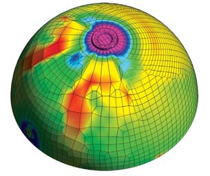
| 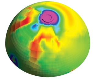 Figure 2b: Another trick to help you identify bogus meshing regions is that you should be able to turn off the mesh outline and not tell where the elements start or stop. See the pronounced variations in stress levels on the left side of this same hemispherical part, in spite of the part’s physical symmetry. |
With a quick menu-click and perhaps some rotations, you have a colored contour graph showing … what exactly?
Judging Good and Bad FE Shapes A standard rule of thumb is that the element shape should be “pleasing to the eye” and maintain this regularity across the model. Although it’s a subjective approach, if the mesh appears to be close to having 1x1x1 proportions, you are good to go. |
Time to back up. What is glossed over in most explanations is how the analysis engine generates stiffness equations from oddly shaped elements defined in two or three dimensions. It is an amazingly beautiful process of simplification done over several stages.
First, each element is broken down into quadrants. A weighting formula is used to calculate the approximate volume of each element using simple polynomials. Known as Gaussian integration, this step is the cornerstone of all FEA technology. Without this simplification, FEA would not exist.
Second, the software generates stiffness equations and the analysis engine applies the given constraints and loads. Then, the engine calculates all of the displacements at the element’s corner points or nodes, leading to the next question: How does it generate stresses from displacements away from the element’s corners?
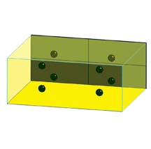
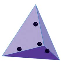
The answer lies in another great trick of the FEA process. Theoreticians have determined that the best place to calculate stresses in finite elements lies at the Gaussian integration points (the center of the quadrants). The software then takes these displacements and uses Gaussian integration to calculate first the strain and then stress within each “Gaussian volume.” Most finite elements are analyzed using four Gaussian integration points, and thus the analysis engine generates stresses at four discrete points within the element. (See Figure 1.)
|
But how do these Gaussian integration points relate to what we see on our real-world contour plots? Because most users have no use for raw element data, one final processing step is done. Values for the Gaussian point stresses are interpolated into the element’s center, and also extrapolated out to the corner points or nodal points. At this stage, the analysis engine has done its work—and the visualization process starts.
De-bugging Jagged Stress Contours
You are more knowledgeable now than many stress analysts about how element stresses are computed, but what exactly are you seeing? These millions of extrapolated points have been loaded into the software’s graphic display system and presented as a dazzling, yet smoothed spectrum of colors. Smoothed is a key word here.
Saint-Venant’s Principle of Decreasing Load Effects The principle allows FE algorithms to replace complicated stress distributions with simpler ones as long as the boundaries are small. You can compare this situation to electrostatic field effects, where the field decays as 1/(ri+2), where i relates to the number of poles. |
In the default mode, FEA programs average the corner point stresses from each element and only present the averaged value to the user. This little smoothing technique has its good and bad points. Overall, it is a good thing because it smoothes out the stresses into a cleaner pattern. Numerically, this process adjusts for the non-physical variations in stresses that stem from minor variations in the element’s shape.
Because physical stress is not a step-function (it wants to flow smoothly), numerically smoothed results display the more accurate solution. If they don’t, you should definitely worry! This is the garbage part. Alarm bells should ring, which brings us to the task of developing your FEA eyes.
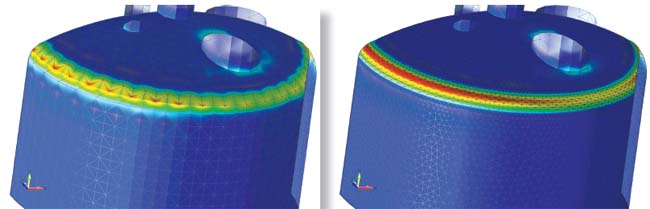
When contours look jagged, with lots of red spots (see Figure 2a) or have extremely irregular shapes, three causes are likely:
- poorly applied loads and constraints (likely);
- complicated or bad CAD geometry (tricky); or
- poor mesh quality. (See “Judging Good and Bad FE Shapes” to the right.)
Because we are using finite elements to approximate a continuum, sometimes it’s best just to accept a few discrepancies when they can be easily explained as a reality of the modeling process. For example, one could quote Saint-Venant’s principle and say that stress and displacement contours away from load application points, and do not depend on how the load was applied (concentrated or distributed) because forces and moments are always conserved. In other words, if the region of interest is far away from the load application point, you can ignore the less-than-smooth stresses around the load and constraint points.
From a geometric point of view, designers hand over CAD files that include every manufacturing detail down to 0.005-in. sharp edge-breaks or small diameter oil-feed passageways. Typically, we can (and should) ignore these small regions by invoking another useful relationship from Jean Claude Barré Saint-Venant. (See “Saint-Venant’s Principle of Decreasing Load Effects,” page 18.) He discovered that small features only create localized disturbances in the stress field. The extent of this disturbance is no more than three times the characteristic dimension of this small feature. For example, for holes of radius R, this size is 3*R. Thus, if your objective is to determine the overall stress of the structure, localized excursions in the stress field will not affect your final answer. This can be easily proved by running two analyses on a part, both with and without a few holes and verifying that the results will be essentially identical.
If the small features are truly relevant and cannot be simplified away, then you will have to set the mesh density to be increased so that the resulting stress field looks smooth and realistic. (See Figure 2b.) Your existing software may handle this with no problems, or you may find you need to divide the geometry into subsections for the mesher to properly deal with the peculiarities of your part. (See Figures 3a and 3b.)
Interpreting Stress Results
One more back-to-basics reminder: Stress is force divided by area. This basic tenet of stress analysis sounds simplistic, but it’s extremely useful. For example, if you have two bars with the same cross-sectional area—one aluminum and the other steel—and the same force is applied to each bar, then each bar will undergo the same stress. In the age before computers, this is why stress guys could build scale models of complicated structures in plastic and get useful information.
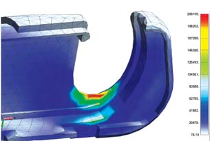 Figure 4: Sometimes, results seem to make no sense but are good enough if interpreted correctly. This surgical anvil has a yield strength of around 100,000 psi. With a calculated stress of more than 200,000 psi, the part has already broken. This shows the power of visualization knowledge—you know when “good enough is good enough,” and remeshing would be just a waste of time. |
In other words, if you are applying force or pressure to a structure, the resultant stress will only be a function of the geometry of the structure and not its material. One can then do material selection on the fly, since the model’s maximum stress value is valid whether the material is plastic, aluminum or steel. The only thing that would change is the deflection of the structure, which scales with the elastic modulus.
A common occurrence in the interpretation of stress results is when the model returns a very high stress value—say, 500 megapascals (MPa)—when the user knows that the material of choice for this structure (low-grade steel, for example) has an actual yield stress of 300 MPa.
How does this happen? Because the FE calculation is linear, it has no idea that the material would plastically deform or break above the material’s yield stress; it just makes the calculation based on the load and the geometry. This is where the user must interpret the result. Perhaps the load is unrealistically high and in reality, the load is half this value. In this case, because the stress results are linear, they would scale with the load. The stress result should be 250 MPa and the structure would survive. (See Figure 4.)
Visualizing Beyond FEA
Many other analysis techniques (computational fluid dynamics, for example) use finite element grids to lay down spatial domains. In all cases, the numerical solver is trying to capture a smoothly varying field, whether fluid velocity or electromagnetism, and if the grids are smoothly arrayed, then a better solution will naturally result.
The human eye is a powerful tool for recognizing regularity, since non-regularity can often indicate danger or a predator lurking in the grass. In short, keep your grids smooth and regular, let your eyes be a critical judge, and you’ll be far safer in your numerical analysis work.
More Info:
Predictive Engineering
Siemens
George Laird, Ph.D., P.E. is a mechanical engineer with Predictive Engineering and can be reached at [email protected]. Contributing Editor Pamela Waterman, DE’s simulation expert, is an electrical engineer and freelance technical writer based in Arizona. You can send her e-mail to [email protected].
Subscribe to our FREE magazine, FREE email newsletters or both!
Latest News
About the Author
DE’s editors contribute news and new product announcements to Digital Engineering.
Press releases may be sent to them via [email protected].