Ultimaker Reveals new Cura Interface
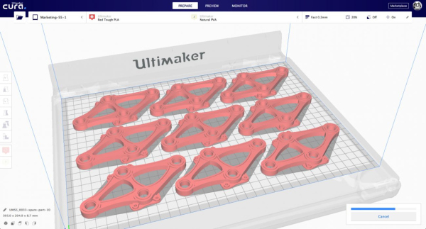
Ultimaker Cura’s new interface features what is said to be a more logical workflow, based on user research.

Ultimaker Cura’s new interface: Recommended mode. Image courtesy of Ultimaker.
Latest News
January 14, 2019
Ultimaker Cura is designed with many features to support users’ needs. In the new user interface, the company presents these features in a way that is intended to be based on the workflow of its users, Ultimaker reports. Three stages are shown in the header to give a guidance of the flow. The stage menu is populated with collapsible panels that allow users to focus on the 3D view when needed, while still showing important information at the same time, such as slicing configuration and settings.
The new UI creates more distinction between recommended and custom mode. Novice users or users who are not interested in all the settings can easily prepare a file without diving into details.
Users can now also go to the preview page easily to examine the layer view after slicing the model, which previously was less obvious or hidden.
The Marketplace and a user account control have been integrated into the main interface to easily access material profiles and plugins, manage plugins that require a login (such as Cura Backups), and other features that are set to follow later in 2019.
Finally, the monitor has been improved, for a more seamless experience between Ultimaker Cura and Cura Connect, according to the company.
The company encourages users to download this early beta of Ultimaker Cura 4.0 to test it out.Another beta will follow in Q1 of 2019.
More Info
Sources: Press materials received from the company and additional information gleaned from the company’s website.
More Ultimaker Coverage

Subscribe to our FREE magazine, FREE email newsletters or both!
Latest News
About the Author
DE’s editors contribute news and new product announcements to Digital Engineering.
Press releases may be sent to them via [email protected].


