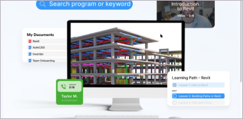
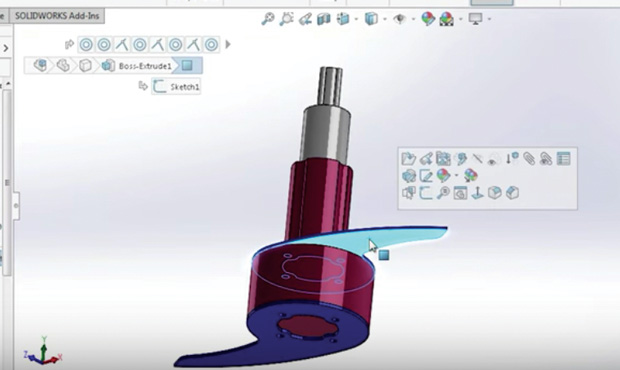
Commands and hints appear in context throughout Onshape. Image courtesy of Onshape.


Latest News
January 20, 2017
In the beginning, Unix created MAN. Short for Manual, it was the only way to learn about arcane commands—and they all were arcane in those days. Today, what we call “user interface” (UI) was in the early days of computing nothing more than a command line and a blinking cursor. Application software early in the “microcomputer” era varied by application as well as by hardware platform. Then Apple wrote the book on human computer interface—literally—with the publication of “Human Interface Guidelines” in 1987. At the same time, Microsoft introduced Windows. The goal was to make the power of the personal computer and the graphic user interface (GUI) accessible to a wider audience than the pricey Macintosh. Much of the software we use today is rooted in user experience (UX) codified in the 1980s. The goal was an intuitive interface that people could figure out—partially or completely—on their own.
 Commands and hints appear in context throughout Onshape. Image courtesy of Onshape.
Skip ahead a few chapters in the history of the user interface and the user experience (UI/UX) to today. We have desktop and mobile form factors. Touch screens are increasingly common. We connect to programs located on our local computer or somewhere in the internet universe (the cloud) through a browser or an app. Large programs with a large feature set now compete for attention with tiny apps offering a targeted—or limited, based on your point of view—feature set.
In the realm of professional engineering software, a transition is taking place in how software is used. Operating system standards are no longer driving the UI/UX. Some of the most powerful programs in engineering—such as high-end analysis or data management—are moving away from reliance on a command line as the primary UI. R&D teams now have separate UI/UX teams, with some members trained in psychology or design instead of programming.
Engineering design software UI/UX trends can be summed up in these four broad themes:
1. make the model the menu;
2. reduce the initial barriers to entry;
3. progressive disclosure; and
4. customization is always an option.
Make the Model the Menu
An emerging theme in engineering software is to keep the action in the center of the screen. Mouse miles should be going down, not up. At simulation software vendor Altair, the interface design mantra is “make the model the menu,” says CTO James Dagg. When a cursor hovers over a specific item, a context-based tool tip will appear. If a specific command is engaged, a transparent representation of the effect appears. “We are always thinking of graphical previews,” notes Chris Peterson, director of User Experience at Altair.
Due to acquisitions, Altair has a much broader product line than it did only a few years ago. There was little commonality from one product to the next. When they did a complete rework of HyperWorks, which introduced a new UI, they realized HyperWorks could set the pattern for updating the user experience of every Altair product. “Our goal is consistency,” notes Dagg.
Modern graphics hardware has been a blessing to interface designers, says Dagg. “Graphical overlays were prohibitive until a few years ago,” he explains. Altair wanted to animate extrusions long before graphics hardware made it practical.
 The revised User Interface in Altair HyperWorks is designed to display all relevant options based on the location of the cursor. Image courtesy of Altair.
PTC Creo is another product sporting an interface that takes its cues from the model. The guiding principle is “geometry-based selection,” says Paul Sagar, VP of CAD Product Management. A toolbar pops up with context sensitive commands, allowing “our users to perform tasks faster because the commands are right there,” he says. More experienced users use more features, notes Sagar, so in Creo a flick of the cursor toward the top of the screen reveals the ribbon bar.
PTC is studying touch as an input for Creo, but is not ready to add it to the desktop software yet. “We don’t see a lot of value in touch for our current user base,” notes Sagar. Touch will come into desktop CAD “to augment the experience, not to define the experience.”
Reduce Initial Barriers to Entry
Last October, Synergis Software released a major update to Adept, its engineering documentation management platform. A focus on being “task-specific and task-focused” led to the time of an average usage session being reduced by 50%, says Todd Cummings, VP of Development.
“There are simple and accepted ways to keep the barrier to entry low,” says Cummings. “Behind the initial presentation, we provide for users who are more technical.”
 When a feature is selected, the bread crumbs display shows all related parts. Image courtesy of Cimquest.
At Dassault Systemès SOLIDWORKS, a new aspect of user interface is what the company calls “breadcrumbs.” Users select a part or an assembly and its relationships are highlighted, such as mates in an assembly. “Breadcrumbs becomes a way to take information from the tree and make it functional,” says Tom Spine, director of User Experience Design for SOLIDWORKS. As with the trend to focus action in the center of the screen, Spine sees breadcrumbs as part of a larger trend. “The interface is becoming invisible; you interact directly on the data.”
Spine says desktop software is adjusting the idea of an invisible interface because of how we use our mobile devices. “You don’t need ‘previous’ or ‘next’ on an e-book reader, you just swipe the screen. It is direct interaction on the object.”
For 2D CAD vendor Graebert, reducing the barrier to entry became a special challenge with the introduction of its 2017 product line. Graebert Ares has become a platform instead of a product, with versions for the desktop (Ares Commander), the browser (Ares Kudo) and the mobile device (Ares Touch).
“We wanted a consistent user experience,” says Cedric Desbordes, director of Marketing at Graebert. What they developed was a cross-platform user experience they call Trinity. “Whatever product or device, we want [commands] to feel the same but be adapted to the specifics of the device,” he says.
On the desktop, an editing command will use a mouse and cursor, while the same command on mobile will use a finger or stylus, but both have the same icon for representation. “We did not want users to choose a platform because of the feature; that would be disruptive,” says Desbordes. “Synergies come from taking full advantage of each platform.”
Having related products in three forms created a potential barrier to entry in the user experience beyond the screen for Graebert—cloud storage. “We are not good at cloud storage, we are good at CAD,” says Desbordes. So Graebert built hooks to all the leading cloud storage options, allowing the user to stay with their preferred cloud storage service.
Progressive Disclosure
Dan Staples, vice president, Mainstream Engineering at Siemens PLM Software, says the user experience can be summed up as progressive disclosure. “Complicated workflows have complicated interfaces,” he says. “We need to lead them in slowly.”
One innovation in Siemens PLM Software’s Solid Edge is elimination of a specific command, replaced by a suggestion. If a user selects the edge of a section of sheet metal, a handle appears to suggest a flange is possible. “The most productive command is no command,” Staples notes. “We have sequences [in Solid Edge] where the customer never goes to the ribbon bar.” Another example of progressive disclosure is in the addition of a separate menu for student users. “They don’t need as much in a feature set,” notes Staples.
 Siemens Solid Edge uses handles rather than commands, where possible. Here, dragging the arrow will create a flange on this sheet metal part, without having to invoke a command. Image courtesy of Siemens Mainstream Engineering.
Siemens is working closely with Microsoft on making Solid Edge work well with the Surface touch-enabled mobile computer. To keep things simple during initial usage, the software will know the difference between a finger and a stylus. “Fingers manipulate the view; pen selects,” says Staples. The distinction is important. “It is an important simplification; fingers are not precise.”
Onshape is the new kid on the block. “We were fortunate to be able to start with a blank sheet of paper, so to speak,” notes Andy Morris, a senior member of the Onshape user experience team. The concept of progressive disclosure is part of the Onshape user experience, but it is not based on minimum viable disclosure. “Our users are building art inside a CAD system; we want people to feel the wow,” he says.
At the same time, Morris notes, “complexity degrades the user experience.” Onshape wants to avoid what Morris and others call “experience rot.” Morris compares his Amazon Fire TV Stick to the remote control that came with his television. The Fire TV Stick has six buttons and one wordless dial; the remote control “has 30 buttons, most of which I will never use.” Amazon and Apple have similar devices that follow a similar theme as Onshape: Repeating patterns and gestures can be powerful.
Customization is Always an Option
All the software products mentioned in this article provide the ability to customize the user interface. More than one noted the ability to do “deep customization” as one of the key differentiators between professional software for experts and less powerful software for a broader market. Onshape offers a programming language called FeatureScript with an unusual distinction: Onshape itself is written in FeatureScript. Essentially, Onshape has published its source code so the user community can extend the product. Doing so doesn’t rob the company of revenue, because Onshape is a cloud-based product requiring access to Onshape servers.
 Onshape allows users to customize all aspects of the program with the FeatureScript programming language. Image courtesy of Onshape.
Creating deeply customizable software is one of the biggest challenges in designing the user experience, says Altair’s Dagg. “There is freedom to arrange tools broadly; some of our users abuse HyperMesh,” he says. But once users can customize on a deep level, those changes must be supported. “We have a saying, ‘no macros left behind;’ old stuff must run too,” he says.
No two users are alike, says SOLIDWORKS’ Spine, so it is important to support end user customization of the UX as much as possible. SOLIDWORKS has thousands of student users, and it has users with more than 20 years of product experience. Spine says whatever they do in opening up the product for customization must work at both extremes of the user base. Spine is also concerned about unwanted complexity creeping into the program via customization. “We start simple, then add complexity over time,” he says.
More Info
Subscribe to our FREE magazine, FREE email newsletters or both!
Latest News
About the Author
Randall S. Newton is principal analyst at Consilia Vektor, covering engineering technology. He has been part of the computer graphics industry in a variety of roles since 1985.
Follow DE